Design That Clicks: Alignment and Proximity Methods
This edition’s chosen theme: Alignment and Proximity Methods. Discover how thoughtful edges and intentional spacing reduce cognitive load, build trust, and guide attention so your interfaces feel effortless, consistent, and genuinely helpful.
When elements line up, the brain spends less time decoding structure and more time understanding meaning. An invisible grid helps users scan faster, predict patterns, and feel relaxed rather than overwhelmed by inconsistent spacing and erratic edges.
Align text to a baseline grid so lines sit harmoniously, especially across columns or cards. Use consistent left edges for labels and inputs to form a clean reading path that supports quick scanning and reduces eye jumps.
Practical Alignment Techniques
Perfect numbers are not always perfect visuals. Circles, icons, and punctuation often need optical nudges to feel balanced. Trust your eye and preview at real sizes to ensure edges appear aligned, not just measured as aligned.
Practical Alignment Techniques
Proximity Methods that Guide Attention
Spacing Hierarchy
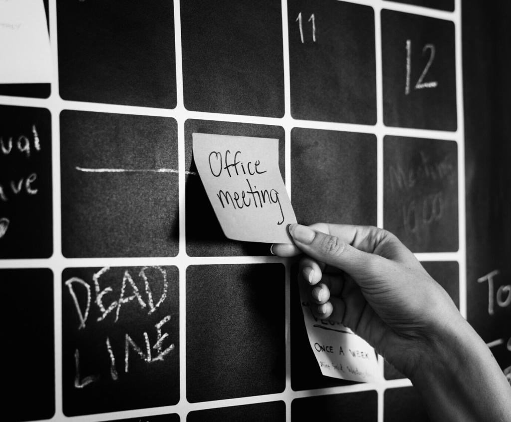
Use larger gaps between groups and tighter gaps within groups to encode hierarchy without extra labels. Define small, medium, and large spacing tokens to keep your hierarchy consistent across modals, cards, lists, and dashboards.
Common Region, Similarity, and Connection
Boxes, subtle backgrounds, and hairline dividers create common regions. Repeated shapes or colors establish similarity. Lightweight connectors, like lines between labels and values, reinforce relationships without shouting or cluttering the interface.
Reducing Form Fatigue
Group related inputs, such as contact details or shipping fields, and introduce breathing space between sections. Clear grouping reduces second‑guessing, makes errors easier to spot, and turns long forms into approachable, step‑like flows.
Our analytics dashboard had charts at mismatched widths, titles dancing on uneven baselines, and filters floating without a home. Teams skimmed, squinted, and often missed the trend they were trying to confirm under pressure.
Ask viewers what they remember after five seconds. If they cannot describe the page structure, spacing needs work. Heatmaps and scroll maps can reveal confusing clusters where proximity or alignment sends mixed signals.
Take a screenshot, draw redlines along left edges and baselines, and list every misalignment. Fix the top three offenders first. Notice how a tidier edge instantly clarifies hierarchy and reduces noise.
02
Refactor a Form
Group related fields with clear headings, use consistent label alignment, and apply a simple spacing scale. Add fieldsets and hints where needed, then remove any decorative dividers that duplicate meaning already conveyed by proximity.
03
Share and Subscribe
Post before‑and‑after screenshots, ask for honest feedback, and tell us what changed in user behavior or sentiment. Subscribe for fresh, practical lessons on Alignment and Proximity Methods and share topics you want us to explore next.